For homeowners, deciding on the ideal living room paint color is crucial. The color scheme for the remainder of your home’s paint often starts in your living room.
Your living room is probably the room in your house that is used the most as well. The inside living room walls give guests and family the first impression.
How about the most incredible wall colors for the living room? Should you choose a warm neutral paint hue or a light, clean white?
Consider putting an additional accent wall to your interior design to make a powerful and striking statement.
Not to add, you may choose from thousands of color undertones for living rooms from brands like Benjamin Moore, Sherwin-Williams, and Farrow & Ball. The final considerations include the following:
You can go crazy trying to follow the latest color trends. Our interior painting specialists selected the top 9 living room wall paint colors of the year to make things simpler for you.
Choosing the appropriate wall color to complement your wood floors might take time and effort. In our most recent article, learn how to select the ideal wall paint for your hardwood floors.
Since the outbreak, everyone has been reconsidering their home’s interior design. We kept things reasonably universal with our list criteria, regardless of whether you have a simple living room decor or a few vivid colors you need to match.
First, we know that the living room’s color scheme must complement the rest of the room. As a result, you should think about how the space interacts with the family or dining room, kitchen, and entry hallway.
Our interior designers avoided the crazily trendy living room hues that are either too warm or too cool. Instead, we decided to use simple-to-match neutral paint hues like greige and taupe pastels.
Lastly, we’ve listed some of our preferred white wall paint hues. To add some interest, we also incorporated a few blue hues with a neutral slant and a couple of different wall shades of green. At the same time, being simple to coordinate with existing interior color schemes.
Let’s get right into the top living room paint color of the year, as determined by our design professionals, without further delay.
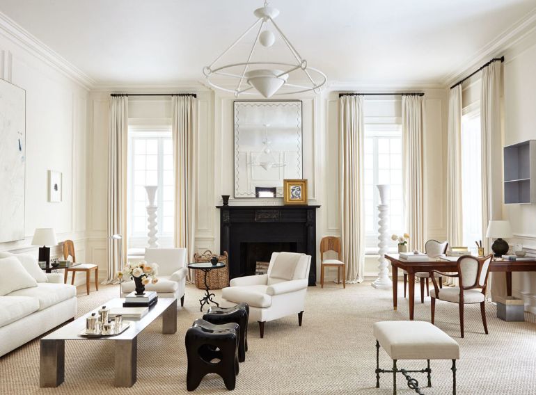
This year’s best living room color choice is Sherwin Williams’ Creamy (7012). It is a warm natural off-white tint that looks best in interior spaces that receive northern light.
As a result, Creamy is a favorite among our designers since it adds cosiness and serenity to a living area. Additionally, this color may significantly brighten a modest living room space with little natural light.
This living room color works incredibly well when changing from old grey colors that were popular a few years ago. Especially if you don’t want to use a stark white because it could look too cold when combined with the furnishings in your current space.
Keep in mind that the tranquil wall color’s slightly pale-yellow overtones might be highlighted by natural light in a living room with a southern exposure. As previously said, we advise Creamy to decorate living rooms that lean toward colder tones.
The fact that this color has a greater LRV of 82 is a disadvantage. A more excellent light reflective value (LRV) means more coats will be necessary for sufficient coverage.
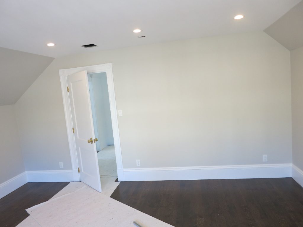
Light Pewter(1464) by Benjamin Moore is another living room color designers have loved this year. It is a warm greige paint color without the bothersome undertones of purple or pink. Additionally, Light Pewter serves as a warm neutral backdrop in living rooms of all sizes.
The famous Benjamin Moore living room hue has enough depth to create a stunning contrast with flat white ceilings and clean white trim.
It has a medium LRV of 68.39, which differs from fashionable off-whites. This can help you paint your living room walls more thoroughly while saving time and money.
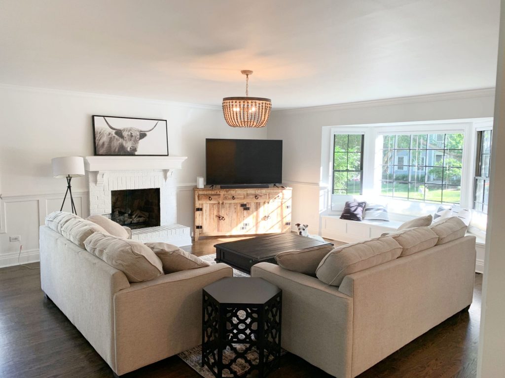
Sherwin-Williams’ Pure White (SW 7005) is another classic creamy white shade that can enliven any little area.
A tiny bit of black and a little yellow give Pure White its soft undertones and warm undertone. Like any white paint, the walls’ underlying color will depend on the furniture in the space.
Pure White’s appearance on your walls will also depend on the lighting in your living room. Warmer lighting can give the impression of creamier walls.
Pure White, however, can feel cooler when illuminated by a white light source. A south-facing room will frequently naturally supply that warmth, whereas a north-facing room will produce a chill.
Pure White mirrors the furniture and lights in your room. In actuality, this makes it more inconspicuous in your design.
You will find it more challenging to conceal darker walls because this white color has a high light reflective value (LRV).
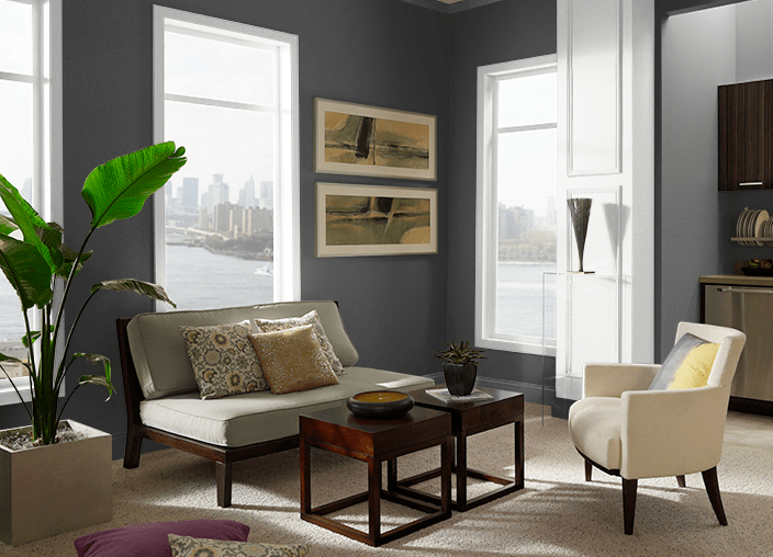
Limousine Leather (MQ5-5) by Behr is the color on the other side of the wheel color. This dark black has grown in popularity, primarily when used with wainscoting. This color option has frequently been employed in dining and family rooms to make the place more opulent.
These deep, darker hues are becoming increasingly common for kitchen cabinets and are frequently applied in matte sheens, as we have discovered.
Generally speaking, using strong yet neutral accent wall colors is one of the simplest methods to dramatically change your room with minimal work. According to us, Limousine Leather goes above and beyond.
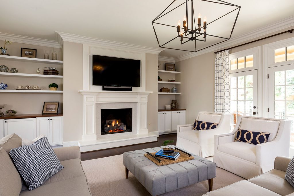
We could not escape the sea of greige while looking for the most outstanding living room color of 2025. As a result, we decided to include Edgecomb Gray (HC-173) by Benjamin Moore on our list of this year’s most popular colors.
This color, similar to Pure White, makes a fantastic neutral backdrop for any striking living room color design. Additionally, Edgecomb provides warm tones that Pure White does not. Give this tremendous warm greige living room paint color a look if you want a comfy living room.
The built-in shelving in your living room should be painted this hue since you’ll be tempted to paint everything with it. It makes a great neutral entire house color for a room THAT RECEIVES lots of natural light and an open layout.
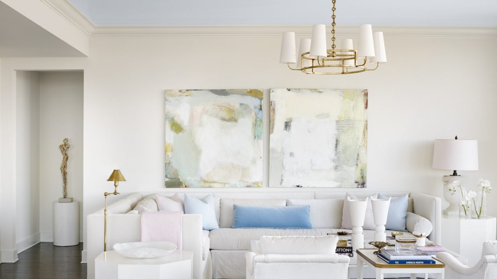
Then, we determined that it was time for a splash of color. True to form, Farrow & Ball’s Borrowed Light (No. 235) is the perfect pale blue color that provides a more relaxed color tone.
Without a doubt, Borrowed Light stands out among the sea of neutral off-whites with a delightfully distinct, airy tone. The blue tint of the walls in the living room further broadens our color palette. All while remaining neutral enough to go with most types of furniture.
Our design team associates a sunny summer day with this delicate pastel blue dreamlike atmosphere. Pair it with wooden beams or wood-toned furnishings for your living room’s traditional yet modern aesthetic.
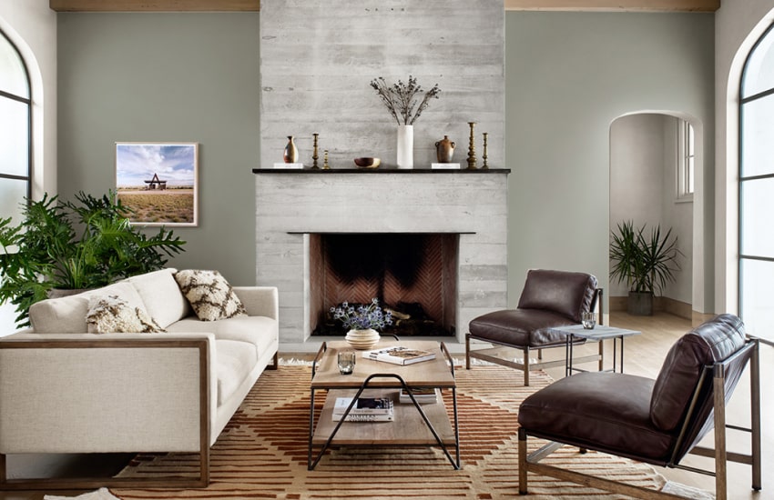
Next is Sherwin-Williams’ Evergreen Fog (SW 9130) for the living room. Sherwin Williams named this warm green tone the year’s top paint color for 2025. Evergreen Fog’s earthy tones are both hospitable and contemporary, in contrast to more fantastic mint greens that frequently feel too cold.
If Evergreen Fog is too dark for your primary living space, Sherwin’s Livable Green can be more to your taste. In addition to being a paler, more earthy hue of green, Livable Green also has grey and neutral undertones. This makes it the ideal shade of green for a living room.
It complements bright white trim or wainscoting well because of this. Finally, stained wood trim or crown moulding works well with either green hue. This enables a gorgeous living room combination that establishes the style for the rest of your house.
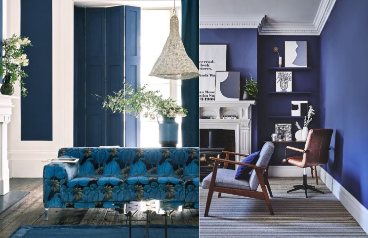
Farrow & Ball’s Serge (No. 9919) carries on the topic of making statements. Purple and grey undertones can be seen in this deep, cool-toned navy. The lighting and decor of your living room will affect how noticeable these undertones are.
Serge is a terrific accent color for open-concept homes, as it has become an increasingly popular choice for kitchen cabinetry. The refined vibe of the color is ideal for any entertainment venue.
It can also be used throughout your floor design as an accent hue. This facilitates a smooth transition from one room to another. Last but not least, this melancholy blue wall color pairs well with gold fixtures and white wainscoting.
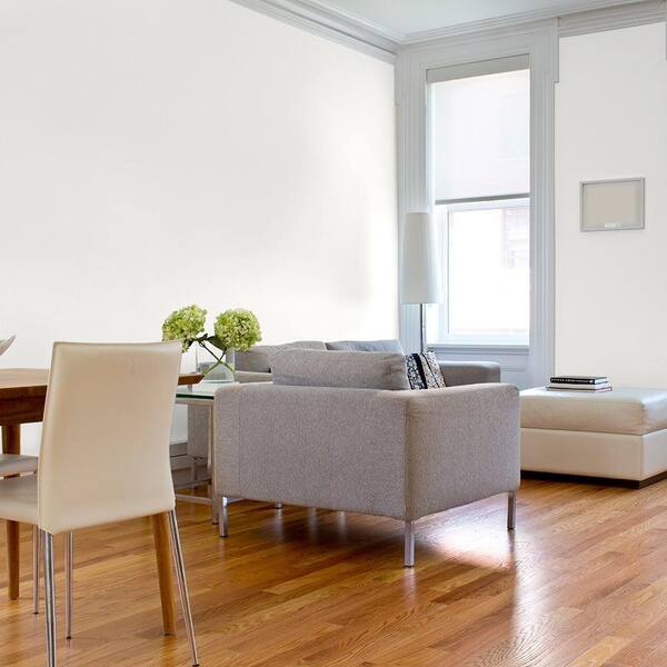
Shaded Whisper(PPG0995-1) by PPG completes the list. For a few reasons, this traditional shade of light grey for the living room is one of my favourites. First, this wall color gives your room a fresh, contemporary feel.
Additionally, this neutral shade gives bigger spaces with furniture and patterns a welcoming and uncomplicated appearance. Additionally, Shaded Whisper has an LRV of 74, so you’ll need more coats to achieve adequate coverage. You’ll end up with a living area that looks like it came from HGTV: clean, sleek, and contemporary.
 Call now


